I have been to a couple of JISC-sponsored events previously at which benefits maps were presented. It was claimed that they can be useful in helping a University to think about return on investment (ROI) in terms of strategic planning. So I suggested benefits maps as being of potential use when I ran an Enterprise Architecture-focussed workshop with the University’s decision-making body (the Portfolio Executive) in a workshop earlier this year. The group agreed to trial the approach and we have been doing quite a lot of work with this tool since then. I’ll give a brief account of this here.

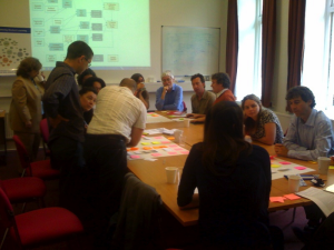
Members of the University’s Technology Enhanced Learning Advisory Network hard at work on a Benefits Map for the Education area
Strategic Maturity
I introduced benefits maps as a tool to assist us as we continue on the journey towards the desirable position of strategic maturity. I am sure there are many definitions of what strategic maturity actually is. My version goes something like this: Strategic maturity is a good position for the University to aim for, a position in which the University’s complex map of initiatives, programmes and projects (the agents of change) are aligned to common strategic aims and objectives. A position in which planned changes (in business processes, culture, IT systems, buildings, governance and so on) are made with a clear understanding of the benefits that they are supposed to deliver, and with the capability to communicate intention holistically and to perform benefits realisation (i.e. to know whether benefits and return on investment are truly being delivered, and if not, then what to do about it). At levels of senior governance there should be clarity and consensus around high level strategic objectives and an ability to state them concisely. Ultimately, to achieve this level of strategic maturity should not only mean that the University performs more efficiently and confidently, but also that it is also able to respond in an agile way to the need for ‘business’ change at any time and thus be very successful at maintaining a competitive edge in all key areas.
Strategy on one page
I discussed with the portfolio executive the nature of the strategic framework within which the University of Bristol operates and whether “Strategy on one page” would be an achievable goal. We have lots of excellent, lengthy strategy documents at the University – the overarching one being the Vision and Strategy document at http://www.bris.ac.uk/university/vision/ – but sometimes I have found it hard to interlink them easily in such a way that it is easy for me, as Enterprise Architect, to help align IT Services planning with strategy (see Section 1 of the JISC Strategic ICT Toolkit for a nice articulation of why organisations seek this alignment: http://www.nottingham.ac.uk/gradschool/sict/toolkit/importance). We haven’t decided on a format for strategy-on-one-page yet, but there are some interesting examples around, see for example the Sorbonne University sample at http://www.sorbonne-university.com/about-sorbonne-university/challenges/strategic-framework. However, we have been trying the benefits maps approach to elucidating the logic of our strategy and to help pave the way towards benefits realisation.
Modelling with benefits maps
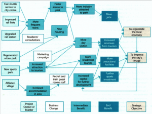
Here’s an example of a Council’s benefits map (click to enlarge) designed to analyse the logic behind plans to regenerate the local economy and improve the city’s image:

There is a useful guide to developing and interpreting these sorts of benefits maps here: http://pspmawiki.londoncouncils.gov.uk/index.php/Benefits_Identification_And_Mapping
There are different approaches to modelling with benefits maps, but this one, with the five key concepts of project/output, business change, intermediate benefit, end benefit and strategic objective is the one I’m currently finding the most useful.
We are now in the process of producing three Benefits Maps: one for the Research area, one for the Education area and one for Support Areas that includes Administration, IT, and Finance. Our initial benefits maps demonstrate a mapping of all our currently planned project outputs and enablers to strategic objectives on a single page per benefits map. This gives us a part-visual impression of the current – “As Is” – state of our strategically focussed activity, based on the current projects portfolio. The next step considers gaps and opportunities and whether we can produce a “To Be” benefits map for each area that demonstrates what the project portfolio would ideally look like in order to fully meet prioritised strategic objectives. Using this methodology may inspire a reprioritisation of projects, or even a coordinated call for new projects, in order to help us to roadmap the way to the envisaged future position. Although we are producing three separate benefits maps for the different areas, we hope to do some interesting work in bringing them together into a simple, unified view of the University’s strategic priorities and supporting activities.
Benefits Realisation
Meanwhile, our Director of Planning is undertaking some work developing comprehensive benefits realisation plans that map to the end benefits in our benefits maps. These describe how we will measure the benefits monitored on an on-going basis as the University continues to strive to deliver on vision and strategy. She is using a balance score card approach. And where “problems” might show up over time (i.e. whereever the measures indicate that in fact we’re not seeing the progress we’d predicted in some area) we hope to be able to use the benefits maps to inform discussions of why benefits are not being realised and to help determine whether we need to action plan our way back on course or whether to leave things as they are (or perhaps even where to cease projects that are not delivering the intended benefits).
Recommendations
Following my (albeit limited) experience in using benefit maps to help groups of people to articulate strategy I would recommend the following,
- When brainstorming benefits maps from scratch, a blank piece of paper for some is intimidating and can produce a kind of writer’s block. When we split large groups into smaller groups of four or five people we found it very useful to have a facilitator working with each group – someone who is already familiar with benefits maps and good at interpreting and representing the verbal discussion in this format,
- We have tried flip chart paper and ‘stickies’ to get small groups working with benefits maps, but using an interactive whiteboard to do this would be more preferable by far,
- Introduce benefits maps by way of example (such as the council one above) and be aware that although the five concepts used seem really quick and easy to understand, some people will confuse ‘output/enabler’ with ‘benefit’ (e.g. someone I worked with was convinced that ‘online exams’ should be shown as an end benefit until I explained that it was an output from which benefits could be derived),
- Encourage concise language – restrict benefits maps to one page (you can always extend the description of concepts in the benefits maps by cross-referencing them to accompanying papers, say).
- Review benefits maps, extrapolate critical pathways in them for further discussion and keep them regularly updated.
The benefits
And what of the benefits of benefits maps?!
- Benefits maps seem to be helping us to build consensus around strategy – they force precise thinking, concise terminology and logical articulations, causing groups of people to engage, focus and agree,
- A comparison of “As Is” and “To Be” benefits maps can be used to develop project portfolio roadmaps,
- Benefits maps can be aligned with benefits realisation plans and give traceability from project deliverables/outputs through to benefits through to strategic objectives. This helps the “where did it go wrong?” discussion should that arise and thus help inform action planning where necessary,
- Benefits maps can be used to highlight key points for discussion – for example, a benefit with no project leading to it could mean that we are missing critical projects needed to bring about strategic change, or a project/benefit leading to no end benefits might mean that the organisation is investing in a project that is not delivering strategic value,
- Ultimately, the development of benefits maps can be useful for aligning IT Services planning with organisational strategy (and presumably for aligning planning in any other part of the organisation). In fact there can be a very direct knock on effect – that fact that the organisation wants to measure end benefits probably means that whole sets of data recorded across the University (from student feedback to the numbers of research outputs per research group, year on year) must be in good enough shape to support business intelligence! Which relates to my earlier blog post on data integration…
